%201.55.34%E2%80%AFp.m..png)

Ever wondered why fast food chains love red and yellow?
Why luxury brands often go for black and gold?
Or why tech companies obsess over blue?
This isn’t a coincidence. It’s science — and a little bit of creative wizardry.
Welcome to the colorful world of brand psychology, where every hue sends a message, triggers emotions, and influences customer decisions before a single word is read.
Today, we’re peeling back the layers (🍌pun totally intended) on how color shapes brand identity — and why yellow might be making your customers just a little hungrier.
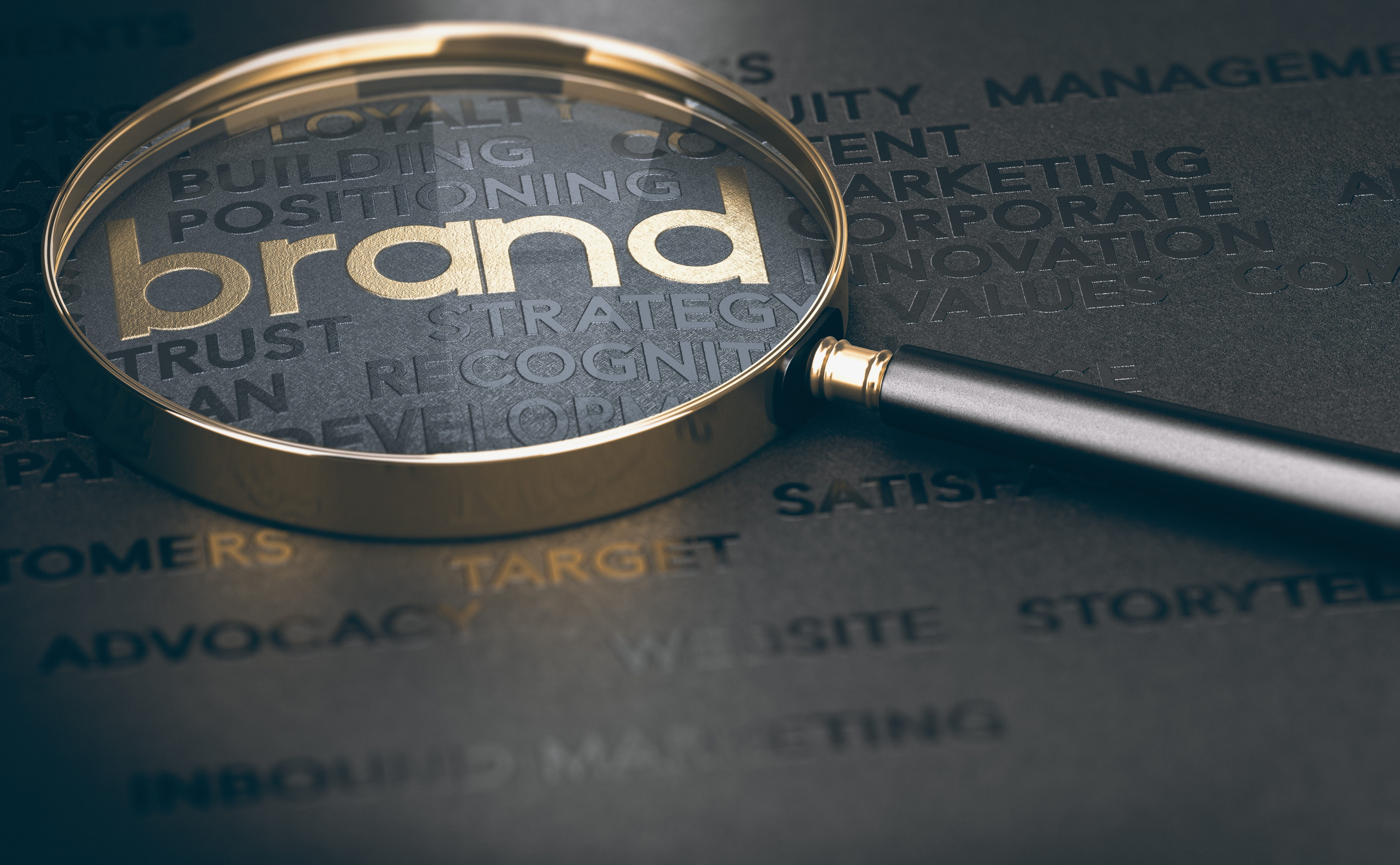
Color Is Not Decoration — It’s Strategy
Color is often the first impression your audience has of your brand. In fact, studies show:
🔹 90% of snap judgments about products are based on color alone
🔹 Color boosts brand recognition by up to 80%
🔹 Color can increase conversion rates on ads, buttons, and websites
At Bananas Creative, we don’t just ask “what looks good?” We ask, “what feels right for your target audience — and aligns with your core message?”
Let’s break it down.
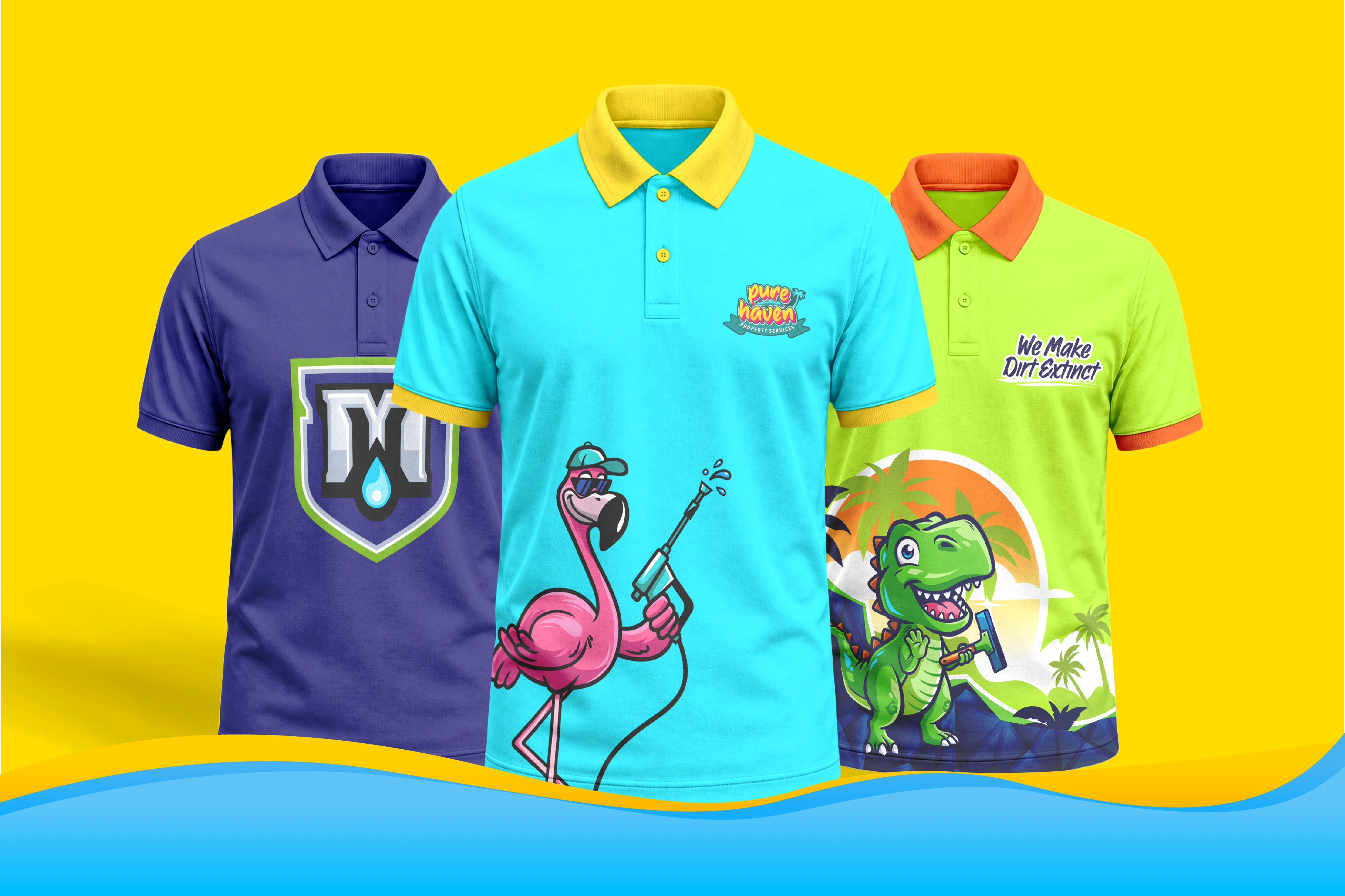
🍟 The Appetite for Yellow & Red: The Food Industry’s Secret Weapon
Walk into McDonald's, A&W, Wendy’s, or In-N-Out and what do you see?
👀 Bright red. Bold yellow. Everywhere.
That’s because:
- Red = Excitement, urgency, and passion
- Yellow = Cheerfulness, energy, and stimulation of the appetite
Together, they create a combo that subconsciously:
✅ Grabs attention
✅ Increases heart rate
✅ Triggers hunger cues
✅ Encourages fast decisions (like fast food!)
⚠️ But if every brand used red and yellow, it would be chaos. That’s why color strategy depends on your industry, customer behavior, and what emotional response you're after.
Color Psychology in Action: How It Influences Behavior
Color taps into the primitive parts of our brains that respond before we even think. That’s why color is such a powerful branding tool.
✅ Blue builds trust
Perfect for banks and tech companies. It calms the brain and says, “You can rely on us.” (Think: PayPal, Facebook, LinkedIn.)
✅ Green soothes and relaxes
Used for health and eco-friendly brands. It connects with balance, growth, and nature.
✅ Orange creates action
It’s playful and attention-grabbing — without the aggression of red. Great for calls to action or fun brands like Fanta or Crush.
✅ Black sells premium
It says “elegant,” “expensive,” and “serious.” You’ll see it on high-end packaging and boutique websites.
✅ Yellow... makes you snacky
It’s energetic and fun. It stimulates mental activity and appetite — no wonder it dominates in restaurants and snacks.
The Danger of Picking the Wrong Color
Imagine a financial advisor using neon pink and comic sans. Or a yoga studio decked out in aggressive red and black.
It sends the wrong message — fast.
Here are real-world pitfalls we help brands avoid:
- Misaligned tone – e.g., a kids’ toy brand using cold corporate blue
- Audience disconnect – using colors your target demographic doesn’t trust
- Accessibility issues – poor color contrast that turns away users with visual impairments
Brand color mistakes aren’t just ugly — they can cost you sales.
Case Study: How We Used Yellow (the Right Way)
One of our favorite branding projects at Bananas Creative was with a startup snack company looking to stand out in a crowded health food market.
They wanted something:
- Fun and snackable
- Energetic and vibrant
- Approachable, but health-focused
We paired bright yellow with pops of leafy green and a handwritten font — giving it an organic, happy, sunshine-y vibe.
📈 Result? In the first 60 days, they reported a 30% increase in sales and got shelf space in three local grocery chains. All thanks to a smart brand strategy rooted in the psychology of color.
Bonus Tips for Using Color Wisely
- Use color to guide behavior. CTA buttons, sale tags, or form fields should pop.
- Limit your palette. Too many colors = chaos. Stick to 2–3 core colors and 1 accent.
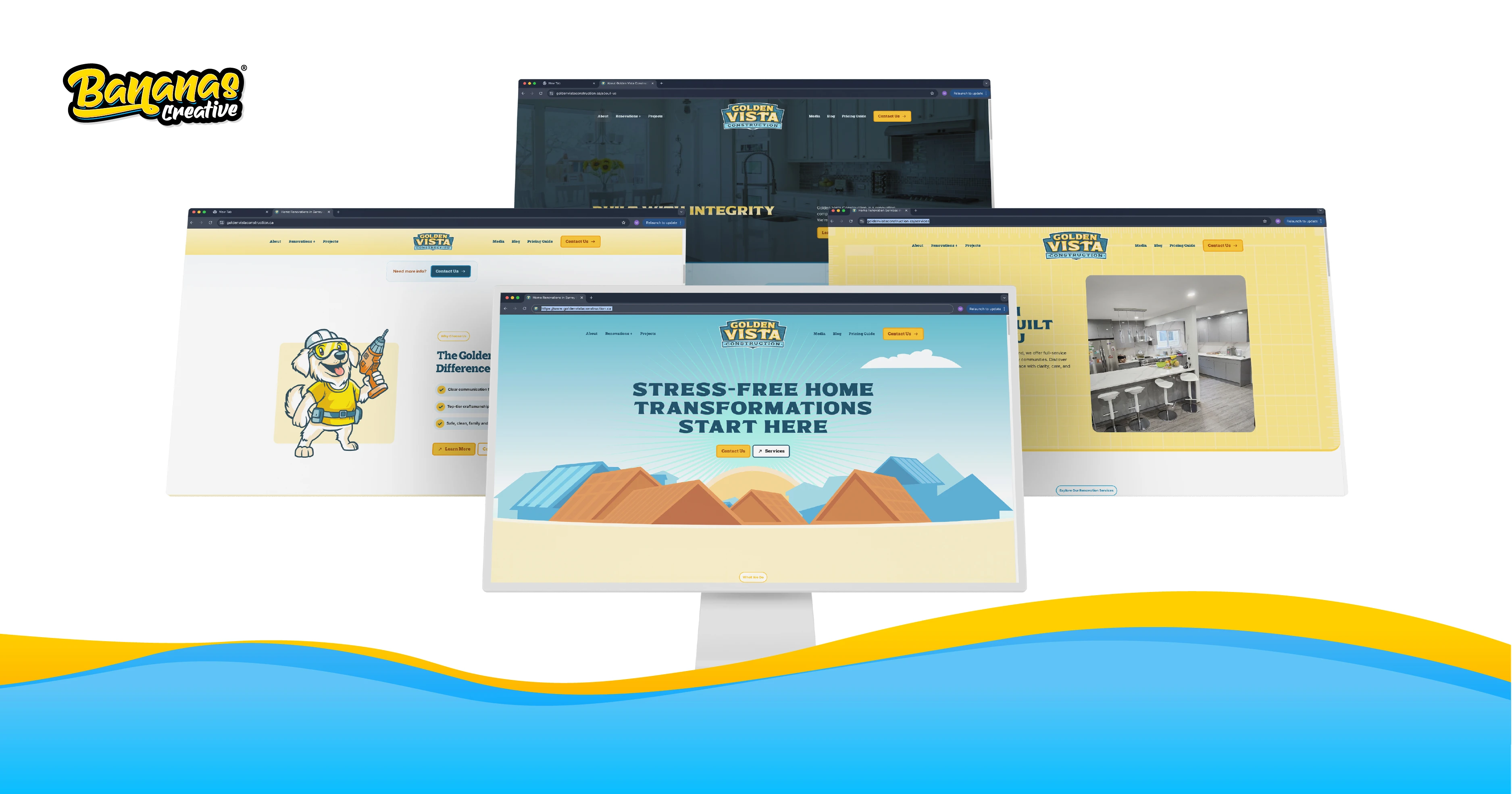
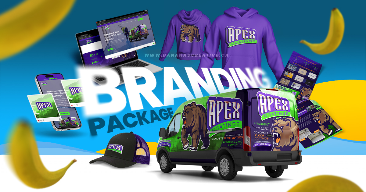
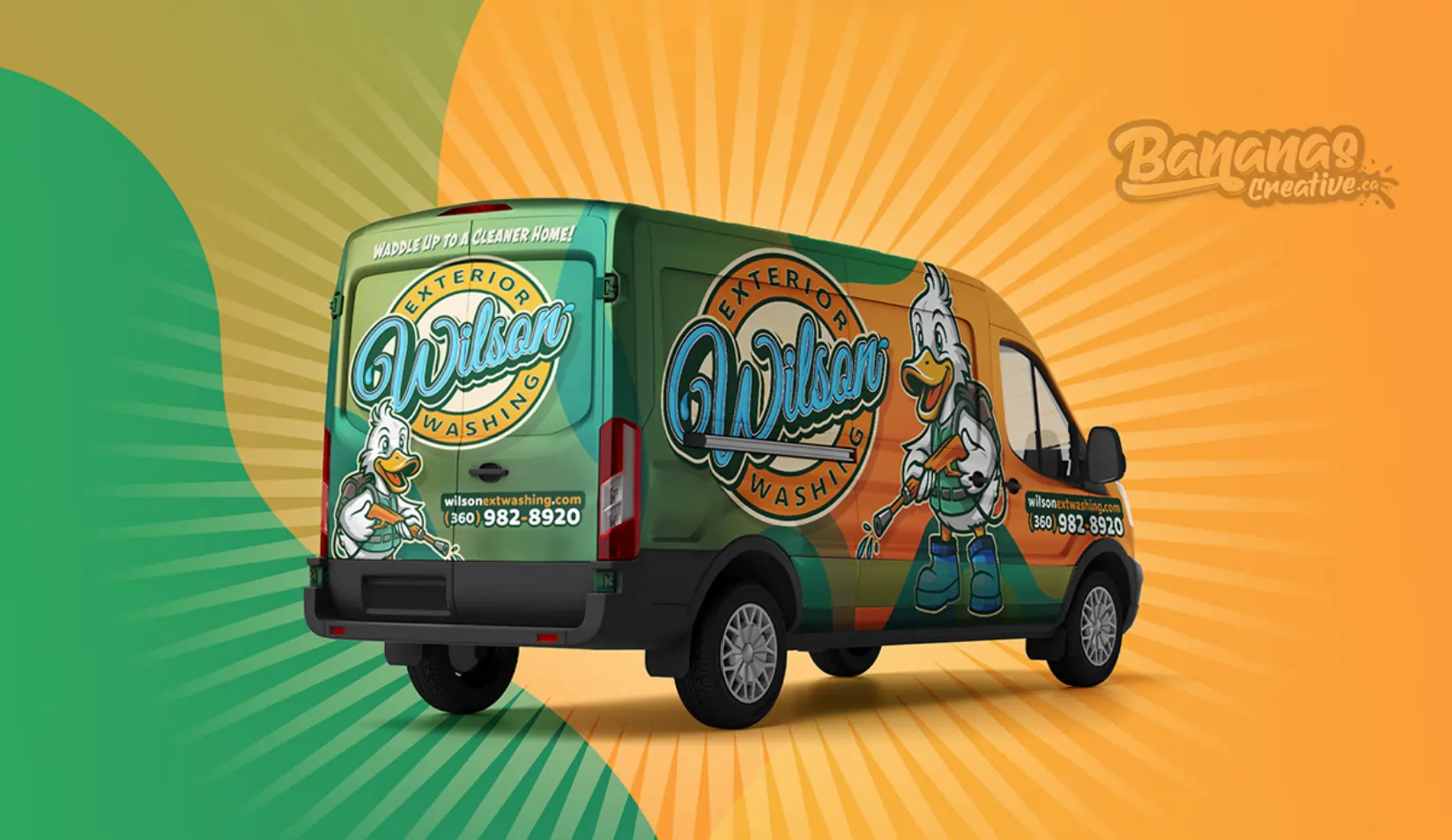
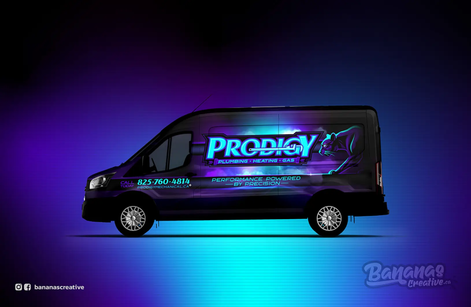
- Think beyond your logo. Apply color consistently across your website, packaging, social media, and vehicle wraps (yup, we do those too).
- Test what works. Run A/B tests on ad backgrounds or CTA buttons to see what converts best.
We Build Brands That Feel and Function
At Bananas Creative, we don’t do cookie-cutter branding. We dig deep into psychology, consumer behavior, and industry trends to give you a brand that’s:
✅ Eye-catching
✅ Emotionally resonant
✅ Designed to convert
Whether you’re launching a new product, refreshing a tired logo, or wrapping a fleet of vehicles in color-coded genius — we’ve got your back.
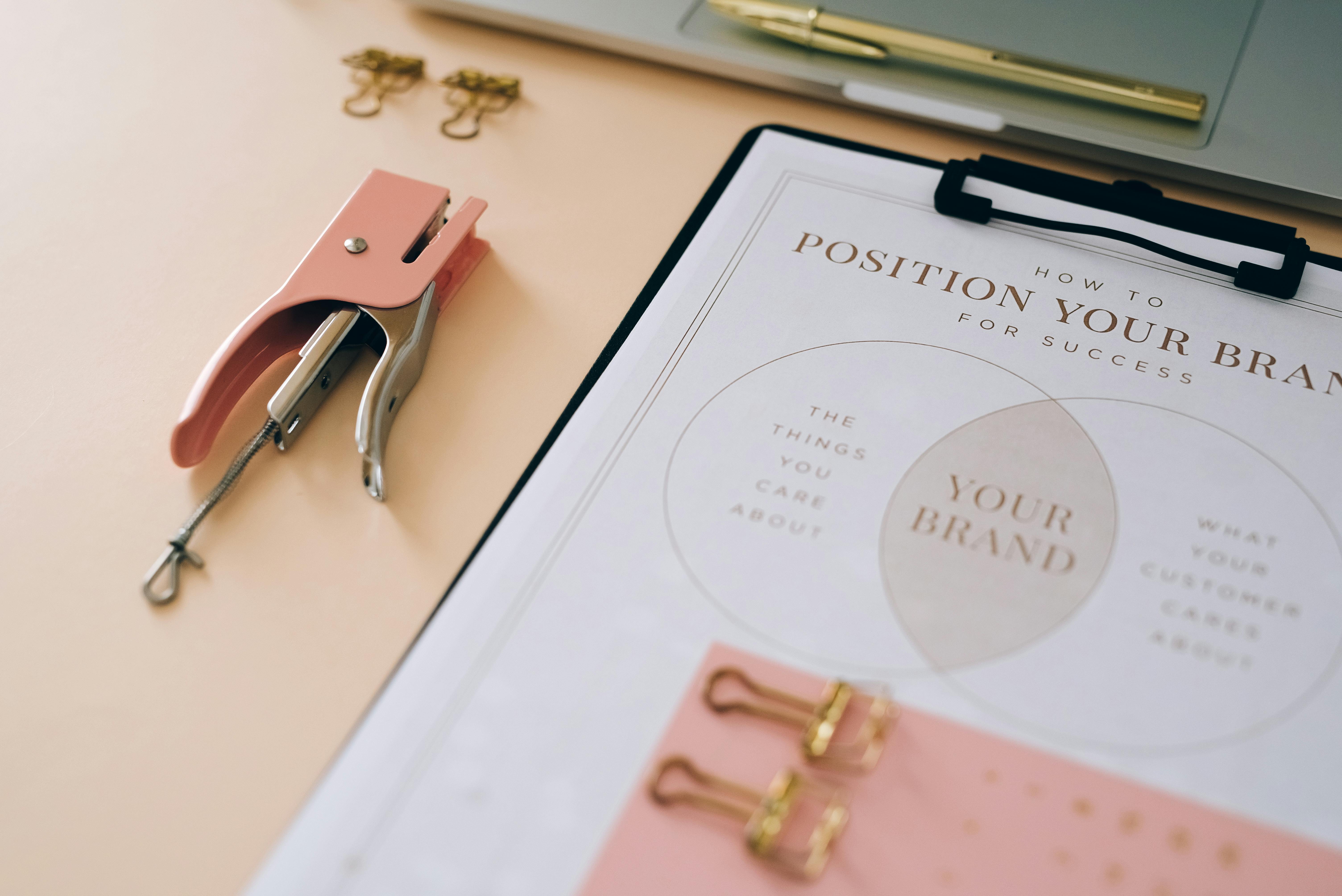
Ready to Pick Your Perfect Palette?
Let’s make your brand impossible to ignore — and totally unforgettable.
📍 Bananas Creative
10631 170 St NW
Edmonton, AB T5P 4W2
Color isn’t just what people see. It’s what they feel.
Let’s make your audience feel the right thing — every time. 🎨🧠


.jpg)


.jpg)


.jpg)


.jpg)
.jpg)
.jpg)
.jpg)
.jpg)
.jpg)


.jpg)


