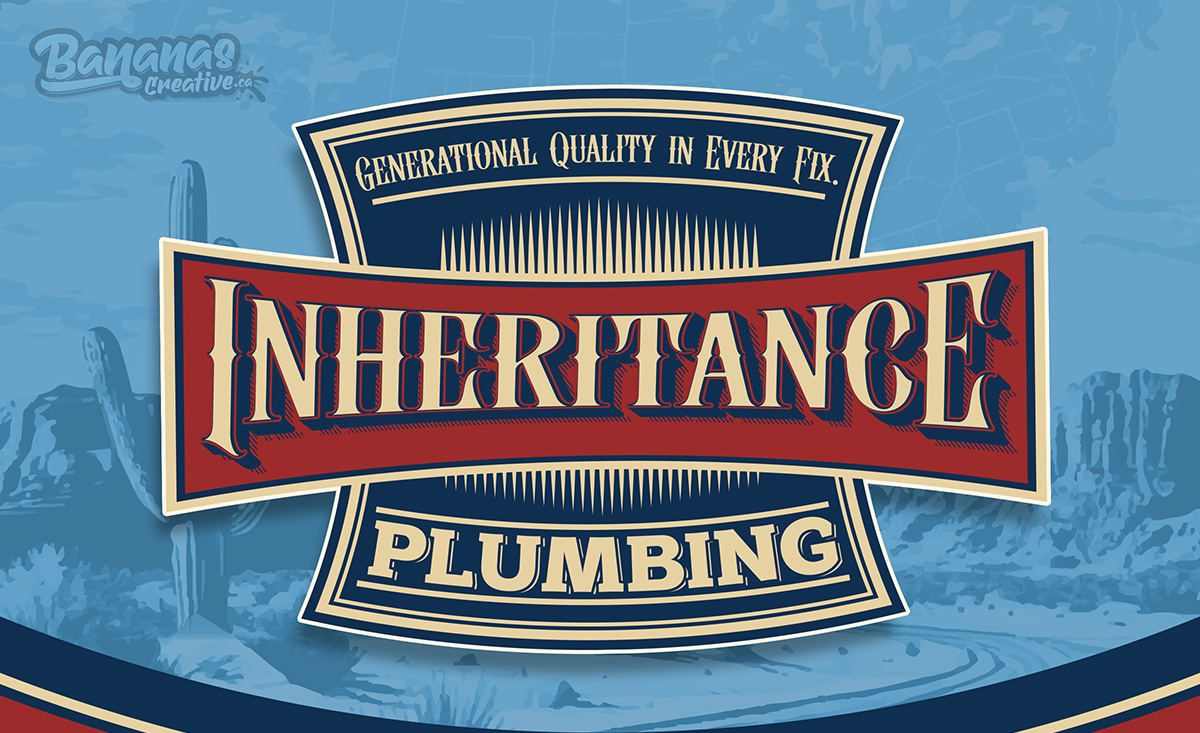
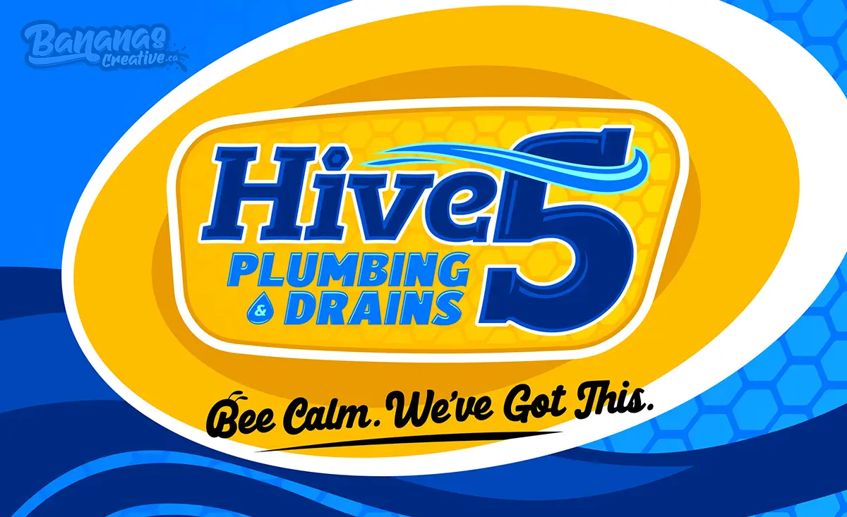
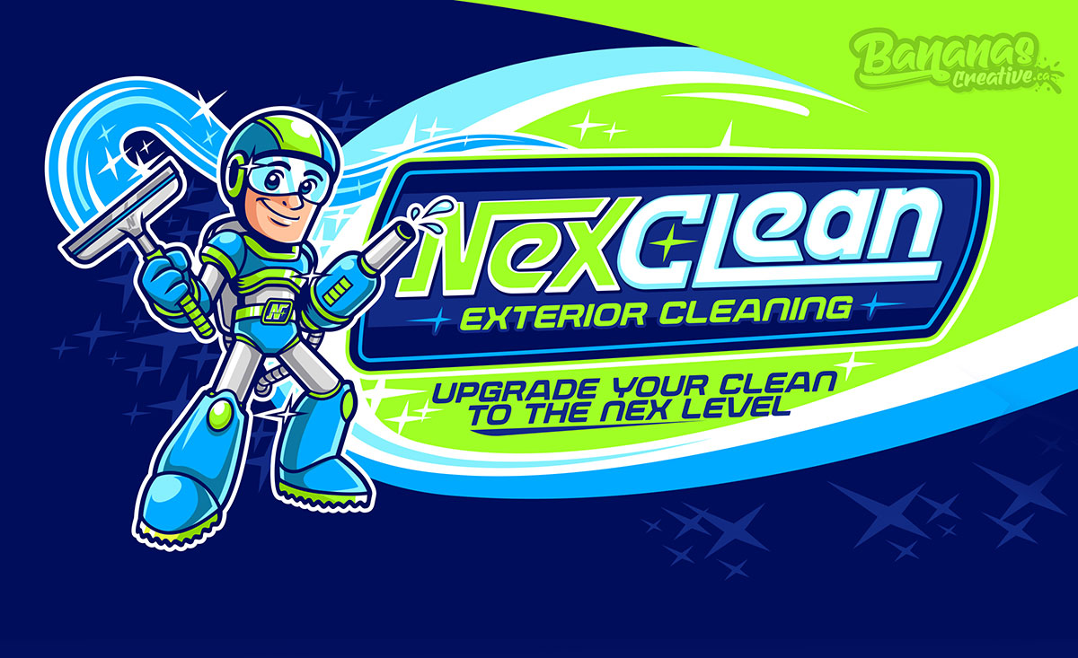
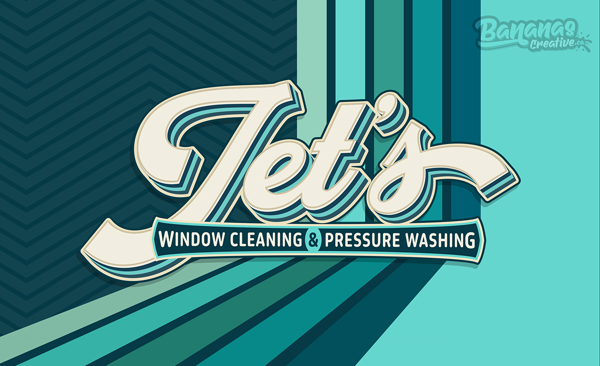
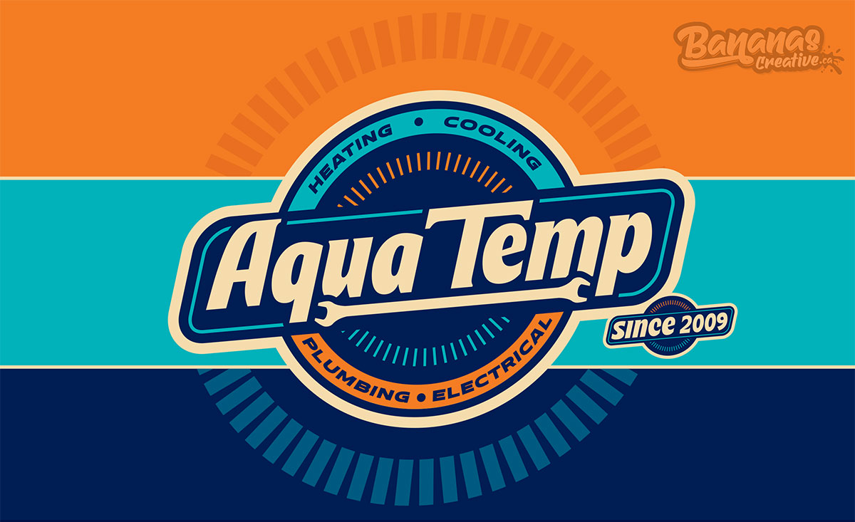
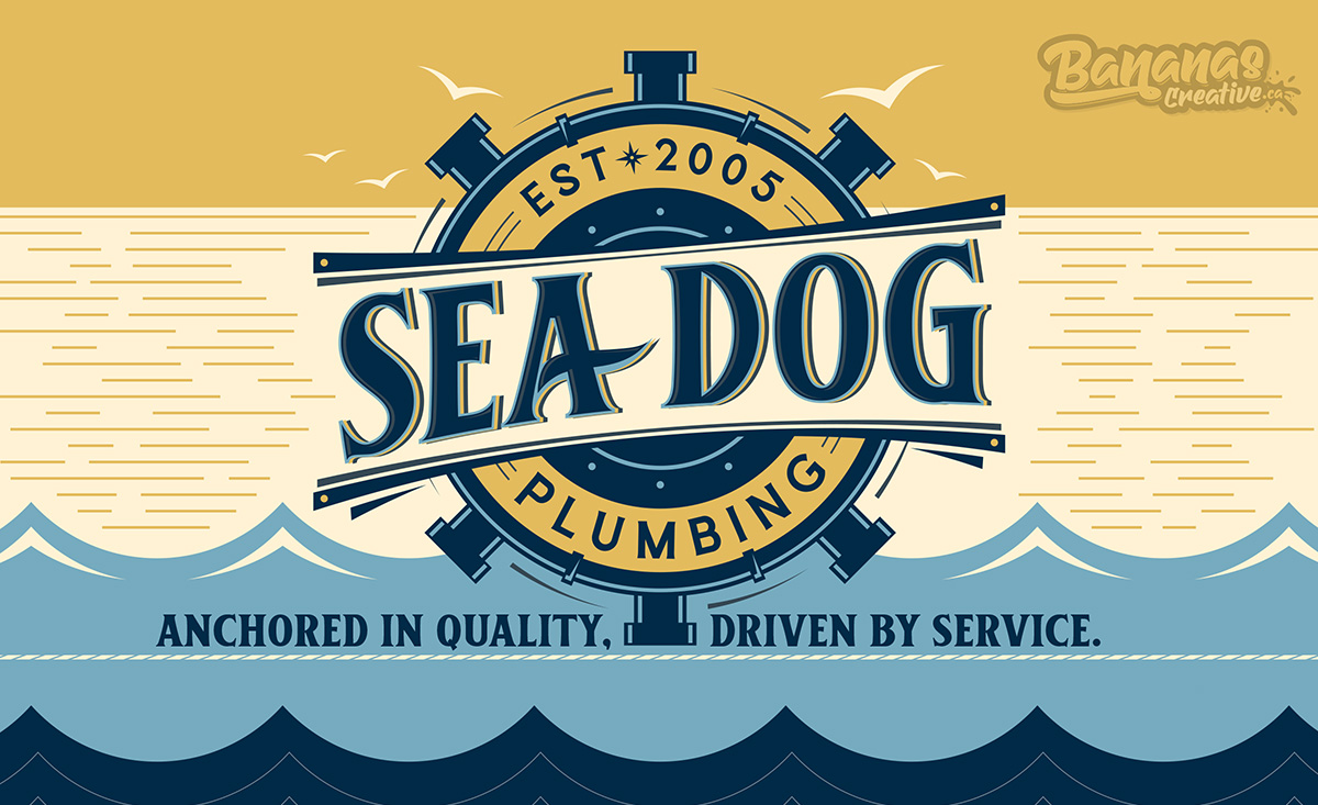
Company Logo Design & Remarkable Branding for Home Service Businesses

Portfolio

Our full portfolio
Hive 5 Plumbing & Drains needed a brand presence that immediately conveyed trust, approachability, and reliability—without blending into the sea of generic plumbing visuals. The goal wasn’t just a logo refresh, but a full branding system capable of working consistently across vehicles, uniforms, printed materials, and digital touchpoints. Bananas Creative developed a character-driven identity anchored by a friendly bee mascot, bold colour blocking, and high-contrast typography designed for real-world visibility. Every element—from the van wrap to stationery and apparel—was designed to work together as a unified system, ensuring Hive 5 shows up clearly, consistently, and memorably wherever their brand appears.
Advanced Septic Services operates in one of the least glamorous — but most critical — home service industries. The goal of this project was to build a brand that felt serious, capable, and unmistakably professional, without blending into the sea of generic septic logos. Bananas Creative developed a visual identity built around strength, control, and reliability. The bold shield mark establishes authority, while the custom rhino mascot reinforces durability and problem-solving under pressure — a direct reflection of the work being done on the ground. High-contrast colours, aggressive typography, and layered textures were intentionally chosen to ensure visibility on vehicles, clarity in low-light environments, and consistency across print, apparel, and digital platforms. This wasn’t about making septic services look “clean.” It was about making them look trusted, prepared, and established — before the truck even arrives.
Pro Glo Permanent Exterior Lighting needed more than a logo — they needed a brand that could visually perform the same way their product does: bold, adaptable, and impossible to ignore after dark. Bananas Creative was brought in to develop a full branding system inspired by bioluminescence, movement, and adaptability. The goal was to position Pro Glo as the professional choice in a fast-growing lighting category, while giving the brand flexibility across vehicles, apparel, digital platforms, and print.
Bananas Creative created a high-contrast, glow-driven brand system anchored by Glo the Octopus — a mascot designed to represent adaptability, control, and illumination. From the logo structure and color system to vehicle wraps, business cards, and social visuals, every brand element was built to move, adapt, and perform — just like the lighting Pro Glo installs. The result is a brand that doesn’t just decorate surfaces — it activates them.
OutWork was built on a simple belief: nothing beats hard work done right. This branding project focused on translating that mindset into a visual identity that feels dependable, approachable, and unmistakably capable across plumbing, HVAC, and electrical services. The challenge wasn’t just representing multiple trades — it was unifying them under a single, trustworthy brand presence. At the center of the identity is Ollie the Otter, a mascot chosen intentionally. Otters are natural problem-solvers, known for using tools, working together, and never backing down from a challenge — the same qualities customers expect when inviting a home service company into their space. The color palette balances energy and clarity: bold greens and oranges for visibility, paired with grounded neutrals that communicate professionalism. From vehicle wraps to uniforms and event setups, every asset was designed to be instantly recognizable, easy to trust, and impossible to confuse with competitors.
OutWork doesn’t rely on flashy claims. The brand does the talking — before the work even begins.
True Flight Roofing needed more than a logo — they needed a brand system that could perform across real-world environments where visibility, trust, and clarity matter most. Bananas Creative developed a cohesive branding system designed to scale across service vehicles, signage, apparel, and marketing materials without losing impact. Inspired by movement, elevation, and precision, the brand was engineered to feel strong in motion and unmistakable at a distance — whether on the road, at a job site, or online. Every element was built to work together: the logo structure, iconography, colour hierarchy, and layouts were designed to reinforce recognition and professionalism across all touchpoints. The result is a brand that doesn’t rely on explanation — it communicates reliability and craftsmanship instantly. This is branding built for performance, not decoration.
Surfside Plumbing was developed as a brand-new plumbing company, starting with a clear goal: create a visual identity that instantly stands out while still communicating reliability and expertise. The concept blends coastal energy with professional clarity, using bright colours, strong typography, and a custom mascot to create an emotional connection without sacrificing trust. From the logo and mascot to the vehicle wrap and print materials, every element was designed to feel cohesive, recognizable, and scalable as the business grows. Rather than relying on generic plumbing visuals, the brand leans into personality and movement — reflecting the idea behind the tagline “Life’s a Wave — Keep It Flowing.” The result is a plumbing brand that feels established, confident, and memorable from its very first impression.
Mr. Dun Plumbing needed more than a logo — they needed a brand that could instantly communicate trust, professionalism, and authority in a competitive home services market. Bananas Creative approached this project from a branding-first perspective, building a complete visual system designed to support recognition, memorability, and long-term positioning. The mascot-driven identity serves as a strategic tool — creating a human connection while reinforcing confidence and reliability across every touchpoint. From vehicle wrap execution to print and digital assets, the brand was developed as a cohesive system, ensuring that Mr. Dun Plumbing shows up with consistency and clarity wherever customers encounter the business. This project demonstrates how strategic branding transforms a service company into a brand people recognize — and remember.
Vanguard Plumbing needed more than a visual refresh — they needed a brand that communicated trust, protection, and professionalism in a competitive Florida plumbing market. Bananas Creative developed a complete branding system built around the concept of the modern-day guardian. Inspired by the idea of a knight defending the home, the identity positions Vanguard Plumbing as the first line of defense against leaks, failures, and plumbing chaos. The project included logo development, mascot design, vehicle wrap concepts, print materials, apparel, and digital assets — all unified by a strong visual language focused on reliability, honor, and craftsmanship. Bold contrasts, clean geometry, and a recognizable character system were used to ensure the brand performs consistently across trucks, uniforms, social media, and marketing materials. This rebrand helps Vanguard Plumbing stand out visually while reinforcing the values homeowners care about most: competence, trust, and protection. It’s a clear example of how Bananas Creative builds brands that do more than look good — they communicate confidence before the first service call is made.
Horizon Exterior Solutions represents the moment where daylight fades and transformation begins. This rebrand was built around the idea of light as an experience, not just a product — creating a visual identity that captures trust, innovation, and night-time impact for a growing permanent LED lighting company. Inspired by the line between day and night, the new Horizon brand balances warmth and precision through bold typography, high-contrast color systems, and a friendly yet professional mascot: Luma the Firefly. Luma symbolizes guidance, reliability, and the joy of illuminating homes long after the sun sets — reinforcing Horizon’s promise to deliver lighting that’s both functional and transformational. Every element of this brand was designed to feel cohesive, memorable, and scalable. The result is a brand system that helps Horizon Exterior Solutions stand out in a competitive home service market — while communicating confidence, consistency, and long-term value at every touchpoint.
NexClean Exterior Cleaning was built to stand apart in a crowded market by turning everyday exterior cleaning into a next-level experience. Inspired by a futuristic hero, the brand introduces NexClean as more than a service provider—it’s a protector of properties and a defender against grime. The concept centers around a custom mascot designed as a high-tech cleaning hero, reinforcing ideas of innovation, precision, and reliability. Every service call feels like a mission, where dirt is the villain and NexClean arrives equipped with advanced tools, eco-friendly solutions, and unstoppable energy. From the bold electric colour palette to the dynamic vehicle wrap, uniforms, and print collateral, the brand was engineered for instant recognition and long-term memorability. NexClean doesn’t just clean homes—it powers them up, delivering crisp finishes, fast response times, and a brand presence that feels confident, modern, and future-ready.
Jet’s Window Cleaning & Pressure Washing was born from a love of the golden era—when service trucks turned heads, logos had personality, and businesses were built on pride and handshake trust. Inspired by classic jet-age design, vintage signage, and bold optimistic color palettes, the Jet’s brand captures a sense of forward motion, confidence, and speed. The name itself reflects the brand promise: fast response times, precise execution, and results that feel like lift-off—clean, sharp, and unmistakably professional. Every element of the identity was designed to be instantly recognizable on the road. From the sweeping motion lines and retro typography to the crisp teal palette and high-contrast applications, Jet’s branding ensures the business doesn’t just blend in with other exterior cleaning companies—it stands apart. This project included a full visual identity system designed to scale across vehicle wraps, signage, printed materials, and digital platforms. The result is a brand that feels nostalgic yet modern—old-school charm paired with modern performance—positioning Jet’s as a trustworthy, memorable, and high-energy service provider that always shows up ready for takeoff.
DogPlay is a premium dog daycare, boarding, and grooming brand designed around the idea that every dog is a hero. For this project, our goal was to create a bold, playful, and instantly recognizable identity that would stand out in a competitive pet-care market while still feeling high-end and trustworthy. The concept centers on the DogPlay Superhero League, where each dog becomes part of an elite team with its own personality, energy, and sense of belonging. This narrative guided every visual decision — from the comic-inspired logo system to the larger-than-life mascot and vibrant color palette that blends fun with professionalism. A major focus of the project was visibility and memorability in the real world. The vehicle wrap was designed as a moving billboard, transforming DogPlay’s shuttle into a “Hero-Mobile” that captures attention on the road and reinforces brand recall throughout the city. Supporting assets such as stationery, apparel, and social visuals ensure consistent brand recognition across every touchpoint. This project showcases how strategic branding, strong storytelling, and bold visuals can elevate a service-based business into a brand people remember, trust, and feel emotionally connected to.
Building While Giving Construction was created with a clear mission: build quality projects while making a positive impact in the community. Our goal was to translate that purpose into a bold, friendly, and instantly recognizable brand that could stand out in the construction industry while communicating heart, trust, and approachability. The brand centers around “Hardy the Heart”, a custom mascot designed to symbolize generosity, reliability, and hands-on craftsmanship. Hardy represents the idea that every project goes beyond materials and tools — it contributes to something bigger. His friendly expression, construction gear, and warm colour palette help humanize the brand and make it memorable for families and communities alike. From there, we developed a cohesive visual system that works seamlessly across vehicle wraps, signage, apparel, business cards, and beyond. The vehicle wrap was designed for high visibility on the road, using bold colours, large typography, and the mascot as a focal point to ensure instant brand recognition. Supporting collateral reinforces consistency while keeping the message clear, positive, and approachable. This project is a great example of how strategic branding for home service and construction businesses can communicate values, build trust, and create a deeper emotional connection with customers — all while standing out in a competitive market.
Miracle Man Plumbing is a well-established plumbing company in Arizona, proudly serving local communities since 2005. As the business continued to grow, the goal of this project was to create a bold, recognizable brand identity that reflected their experience, reliability, and strong connection to the region they serve. The branding concept draws inspiration from Arizona’s landscapes and the idea of a trusted local professional — a modern “Miracle Man” that homeowners can rely on when it matters most. Warm, earthy tones paired with deep blues help balance approachability and professionalism, while the illustrated character reinforces brand personality and memorability across all touchpoints. This project included the development of a complete visual identity designed specifically for this company. From logo design to print materials and vehicle wrap graphics, every element was built to ensure consistency, visibility, and impact in real-world applications. The vehicle wrap, in particular, was designed as a mobile billboard — helping Miracle Man Plumbing stand out on the road and remain top-of-mind in the local market. The final result is a cohesive, scalable brand system that supports long-term growth, builds trust with homeowners, and positions Miracle Man Plumbing as a dependable, professional plumbing company in Arizona’s competitive home service industry.
Aqua Temp came to us as an already established home-service company—trusted by Saskatchewan homeowners since 2009, but ready to elevate their presence with a brand that matched their reputation. Their previous identity no longer reflected their quality, their growth, or the wide range of services they now provide. We developed a complete rebrand that brings modern energy, professionalism, and clarity. From a bold new logo system to refreshed vehicle wraps, apparel, digital assets, and a cohesive brand voice, the new Aqua Temp identity communicates trust, expertise, and a “life’s better at the perfect temp” promise designed to stand out online and on the road.
Summit Pest Control partnered with us to build a high-impact brand that would stand out in the pest control industry and communicate trust, safety, and expertise. As a home-service company competing in a crowded market, they needed a visual identity that was memorable, approachable, and instantly recognizable on the road. We developed a full branding system — logo, mascot design, colour direction, uniforms, business cards, social media assets, and a full vehicle wrap — all built around the idea of “Conquering a Pest-Free Peak.” This brand helps Summit: Build credibility with homeowners, Stand out from traditional pest control companies, Create a family-friendly, trustworthy brand presence, and Increase visibility. The final identity blends outdoor adventure, clean environmental tones, and a friendly guide-style mascot to position Summit Pest Control as the company homeowners can rely on to protect their spaces.
Door X Garage Services started with a vision — build a garage door company that felt modern, memorable, and instantly trustworthy from day one.
Before opening their doors, they knew they didn’t want a generic look or a templated brand. They wanted something bold… something fun… something homeowners would recognize the second the van pulled up. So we built Door X from the ground up — a complete brand creation designed to launch the business with confidence and set the tone for long-term growth. Inspired by the energy of the West Coast, we developed a bright, high-visibility colour palette, clean and powerful lettering, and a friendly T-rex technician mascot that instantly connects with families and homeowners.
The result? A brand system built to stand out, drive trust, and help a new company enter the market like a leader, not a beginner. From logo design and uniforms to a full wrap and a conversion-focused website, Door X launched with: Strong brand recognition from day one, A playful but professional identity, Maximum visibility on the road, A cohesive look across print, digital, and onsite uniforms. Door X isn’t just “new” — they launched with a brand that looks established, reliable, and ready to dominate their market.
Hoss Wash wanted a brand that reflected their cheerful personality and helped them stand out from more traditional exterior-cleaning companies in the area. We developed a full rebrand built around a playful seahorse mascot, vibrant colours, bubbly textures, and high-visibility graphics. The new identity extends across their vehicle wrap, uniforms, yard signs, promo materials, and more, keeping everything cohesive and easy to recognize. The new look gives Hoss Wash a strong presence in their community and a memorable aesthetic that supports their growth as a modern exterior-cleaning company in Ohio.
Sea Dog Plumbing is a coastal plumbing company with deep roots in the community — and its brand deserved an identity that reflected that heritage. For their rebrand, we built a visual system inspired by maritime craftsmanship, coastal reliability, and the loyalty of a seasoned sea dog who knows the waters (and pipes) better than anyone. Anchored in the idea of a trustworthy captain-dog character, the new identity blends nautical motifs, warm coastal colours, and a heroic mascot holding a wrench like a seasoned mariner. This mascot embodies experience, local pride, and the steady service Sea Dog Plumbing has provided since 2005. This new identity strengthens recognition, builds trust with homeowners, and reflects the company’s long-standing values: anchored in quality, driven by service.
Xcalibur Exterior Cleaning is a bold, legendary-inspired exterior cleaning brand built to set a new royal standard in the industry.
Their team needed more than a modern look — they needed a branding system with authority, trust, and a powerful presence homeowners instantly recognize. Inspired by the mythology of Excalibur and the strength of a knight-protector, we created an identity that positions Xcalibur as the elite choice for exterior cleaning. The brand blends gold accents, rich blues, and sharp geometric shapes to convey precision, reliability, and premium service. The centerpiece of the system is the knight — a heroic guardian who symbolizes strength, integrity, and mastery over dirt, grime, and neglected exterior surfaces.
From the typography to the emblem and the detailed mascot illustration, every element elevates the company as the royal standard in exterior cleaning.
Floorange is a bold, citrus-powered flooring rebrand built from scratch for a modern home service business. Their team needed more than a logo — they needed a full branding system that would boost trust, spark recognition, and stand out instantly in a crowded flooring market.
Inspired by the freshness of citrus and the precision of expert installers, we created a high-impact identity led by Citric the Fox, a clever mascot representing speed, craftsmanship, and sharp problem-solving. From the custom logo and character illustration to the colour palette, typography, business cards, apparel, and a full vehicle wrap, every piece is designed to help Floorange look professional, memorable, and homeowner-ready. This project reflects what we do best at Bananas Creative: complete branding systems for home service businesses that want a powerful visual identity, stronger customer trust, and marketing that works on the street, online, and on the job site.
Lucido Walls offers more than surface work—they craft statement pieces in Venetian plaster and natural finishes. Our goal was to build a visual identity that reflected that same depth, elegance, and craftsmanship. From the typography to the refined Roman-inspired mark, everything about Lucido’s brand speaks to a sense of sophistication and trust. We designed a cohesive system that communicates their premium services effortlessly—through apparel, signage, and vehicle branding that feels just as bespoke as the walls they create. In this space, quality isn't just delivered—it's recognized instantly.
Building Health came to us with a mission that goes beyond inspections — they protect families by finding hidden mold before it becomes a real threat.
To support that mission, we built a complete branding system centred around Nitro, their professionally trained mold detection dog.
Inspired by health, trust, and clean air, the new identity blends scientific precision with a warm, relatable hero presence. Nitro represents the company’s biggest strength: accurate, dog-powered detection that standard tools and human senses can’t match.
We developed a full visual system including the logo, colour palette, typography, Nitro’s hero illustration, business cards, apparel, a website interface, signage, and a custom vehicle wrap that turns their service vehicle into a high-visibility health-first billboard.
At Bananas Creative, we specialize in crafting branding systems for home service businesses, brands built to educate, build trust, and turn essential services into unforgettable, homeowner-friendly identities.
Platinum Power Solutions, a fast-growing electrical company in Manitoba, needed a brand that could match their ambition. Their previous identity lacked impact and failed to differentiate them in a highly competitive market filled with generic electrician logos and unmemorable service vans.
The goal was clear: create a bold, professional, and unmistakably powerful brand system that positions Platinum Power as a leader in electrical services—both on the road and online. We introduced The Wolf, a symbol chosen for its strength, precision, and leadership. Wolves move with focus, protect their pack, and operate with sharp instincts—qualities that perfectly reflect a modern electrical company that values reliability, safety and unity. Combined with a metallic, energetic wordmark inspired by voltage, speed and industrial-grade performance, the new identity brings together power, professionalism, and personality. This comprehensive rebrand includes a fully custom mascot, logo system, typography suite, apparel, marketing materials, and a full vehicle wrap designed to dominate Manitoba streets with a commanding visual presence. Platinum Power Solutions now carries a brand that sparks recognition and leads the industry with confidence.
When Zion Garage approached us, they were ready to level up. Their old brand felt generic and didn’t reflect the quality of their epoxy coatings, garage transformations, and storage solutions. They needed a bold, modern identity that would allow them to stand out — not blend in. The new name, Stellar Garage Solutions, captures exactly what they wanted to communicate: Superior craftsmanship, high-end results, and a futuristic level of service homeowners can trust. We developed a complete rebrand built for visibility and recognition. The brand system features a bright, high-energy colour palette, bold typography inspired by sci-fi motion graphics, and a custom astronaut-koala mascot symbolizing exploration, precision and next-level results. From logo and collateral to apparel and a fully wrapped service vehicle, the new identity gives Stellar Garage Solutions a memorable, unmistakable presence in the home service market. This project reflects our mission: to help home service businesses stand out, look premium, and win more customers through strategic branding.
We partnered with Window Remedy to design a brand identity that brings their mission into focus: repair-first, stress-free service that customers can trust. From strategy to execution, we built an entire brand ecosystem that works in harmony—from the clean and confident logo to print materials, a van wrap that commands attention, and a website built to convert. Because when every detail aligns with your values, your business doesn’t just look good—it grows with purpose.
Prodigy Mechanical, based in Alberta, came to us with a clear vision: create a brand that breaks the mold of typical plumbing visuals and delivers a look as powerful as their work. We leaned into futuristic energy with a neon-inspired logo, bold typography, and a fierce panther mascot symbolizing precision and performance. This identity carries through their vehicle wrap, business cards, and stationery — a bold system that commands attention and builds instant recognition. In a sea of typical home service brands, Prodigy Mechanical now leads with presence.
We crafted a bold, nature-rooted brand for Marmot Heating & Cooling — a Vancouver Island-based HVAC company. When Marmot Heating & Cooling came to us, they wanted a brand that felt local, reliable, and instantly memorable. Based on Vancouver Island, their identity needed to reflect both their commitment to service and their connection to the environment.
We delivered a bold visual system that checks every box — from the custom marmot mascot holding a wrench (symbolizing HVAC expertise) to the scenic van wrap echoing the rugged Pacific Northwest landscape. This brand feels like home — while standing out in the competitive HVAC market.
Quick Fit Parts, based in Mississauga, Ontario, needed a brand identity that reflected their professionalism, speed, and reliability — not just in delivery, but in every impression they make. We created a full branding system that supports how they show up across all channels. From a vehicle wrap that acts as a moving billboard, to business cards, uniforms, and a bold new logo, every element was designed to communicate confidence and clarity. This project proves that when your brand looks as solid as your service, it sets the tone for everything that follows — building recognition, trust, and long-term credibility.
When your business looks this clean, people take notice. Wilson Exterior Washing understood something many businesses overlook — that your brand should work as hard as you do.
Together, we built a bold visual identity from the ground up, starting with a vibrant color palette and a custom duck mascot that instantly communicates trust, friendliness, and reliability. That same personality flows across every asset — from eye-catching signage and memorable business cards to a fully wrapped van that turns heads across Washington state.
This isn’t just a fun look — it’s a hardworking, cohesive system designed to spark recognition and drive referrals. Because when you’re showing up in neighbourhoods every day, a strong, consistent brand becomes your most valuable tool.
Built for the boldest team on the block! Snow Cats Snow Removal came to us with a vision: stand out in a saturated winter market with a brand that’s as sharp and efficient as their service. We answered with an identity powered by a duo of ninja-like feline mascots — a memorable team built for visibility, agility, and a little fun. Every piece of the branding — from the electric color palette to the full vehicle wrap and stationery — is designed to reinforce who they are: reliable, fast, and totally unforgettable. Now, when Snow Cats hits the streets of Ottawa, their brand is doing the talking. And the plowing.
When Logic — a plumbing, heating, and cooling company based in Edmonton — approached us, their goal was clear: to elevate their brand and stand out in a competitive market.
We developed a smart, high-impact identity centered around what sets them apart — a name that already suggests confidence and clarity. To bring it all together, we introduced a memorable mascot and a bold red-and-blue palette that ties into the plumbing and HVAC world while making their fleet, team, and materials instantly recognizable. From van wraps to apparel to business cards, Logic now has a brand that works as hard as they do — and sticks in people’s minds long after the job is done.
Golden Vista Construction, based in British Columbia, came to us with one goal: to stand out in a competitive renovation market with a brand that feels professional, personal, and powerful. We designed a full identity system that brings their values to life across every touchpoint — from a bold logo and memorable mascot (based on their real dog, MyLov) to a striking van wrap, branded print materials, uniforms, and a custom Webflow website. Their brand now tells a story — one of trust, personality, and high standards — whether you’re passing their truck, flipping through a brochure, or scrolling their homepage. This is branding that backs up the promise: Golden Standards. Stress-Free Renovations.
T&H Plumbing Services, based in Ohio, partnered with us to build a fun yet professional brand that communicates trust and stands out in their local market. We developed a complete brand system around their unique tagline — Toadally Honest Service — including a bold logo, clean typography, and a friendly tone that connects with customers. From a high-impact vehicle wrap to uniforms and business cards, every asset reinforces their message: they’re honest, reliable, and ready to grow. This project is a great example of branding that works in the real world — built to attract attention and build trust from the curb to the call.
Pane Relief came to us ready to wipe the slate clean and build a brand that matched the clarity of their service. As a window cleaning company in Edmonton, they needed a look that stood out in local neighborhoods, felt friendly and polished, and left a lasting impression. We developed a full visual system that’s bold, bright, and instantly recognizable — centered around a charming, custom mascot and a vehicle wrap designed to drive visibility. From logo and print materials to apparel and fleet design, every piece of their brand now reflects their promise: clear, reliable service with a friendly face.
For Predictable Plumbing, trust isn’t just part of their brand — it’s the whole foundation. They came to us looking for a standout identity that would feel professional, relatable, and above all, personal. So we built a cohesive brand system around what matters most to them: reliability and quality service. Their actual dog became the brand mascot — a charming and trustworthy companion that customers connect with instantly. From the custom logo and mascot to the vehicle wrap and stationery design, every element reinforces their brand promise: “Trained to Fix It Right.”
We partnered with Salmon’s Moving and Storage, a trusted relocation company based in British Columbia, to refresh their brand presence from the ground up. The result? A clean, professional identity that builds credibility and visibility across every customer touchpoint. From a custom logo to branded stationery and a head-turning truck wrap, the full suite is designed to reinforce trust and support growth in a competitive moving industry.
Firerock Landscaping does more than shape backyards—they build rugged, lasting outdoor spaces in Medicine Hat and beyond. They needed a brand identity that could live up to their name: something bold, unmissable, and built to last. We crafted a high-impact visual identity centered around a bold logotype, stylized mascot, and a vibrant color palette inspired by natural tones and industrial durability. The goal? Create branding that feels strong, reliable, and a little bit fearless.
We teamed up with CSL Sewer Cleaner to build a standout brand identity tailored to the underground utility and sewer services industry. From the bold custom gator mascot to high-contrast vehicle wraps and field-ready apparel, every touchpoint was designed for durability, recognition, and trust. Whether relining pipes or cleaning drains, their brand now works as hard as they do across Alberta.
Spire Security now has a modern identity that sets them apart from traditional competitors. The consistent visual language helps reinforce trust across every client interaction—whether it’s a fleet van parked on-site or a business card handed off in a first meeting. We designed a clean, tactical brand system featuring a bold owl mascot and structured typography, symbolizing awareness and intelligence. The logo was crafted for versatility across digital and physical formats—ensuring immediate recognition and trust.
We helped Magic Nettoyage, a residential exterior cleaning company in Saint-Constant, Quebec, ditch the bland and go for bold! Their new, character-driven brand is anchored by a custom frog magician mascot – a charming symbol of their 'magical touch' cleaning promise. We really peeled back the layers to build them a brand that's anything but ordinary. Now, Magic Nettoyage isn't just cleaning homes; they're showcasing a premium, trustworthy presence that truly matches their top-tier service. This vibrant brand system has exploded their visibility in the community, boosted their credibility with homeowners, and given them the powerful tools to confidently grow and shine in a crowded market.
We partnered with Goat Giver to create a versatile brand system and website—designed to support their full range of services across solar, electrical, and construction industries. We developed a flexible brand identity extended across vehicle wraps, business cards, site signage, and a custom website built for clarity, conversion, and service scalability.
Dazzle Window Cleaning is a Toronto-based company known for fast, friendly, and high-quality service. They wanted a brand identity that would reflect their vibrant personality and help them stand out in a competitive home service market. We built a high-energy visual identity for Dazzle Window Cleaning, featuring a custom mascot, bright color palette, branded signage, and a showstopping van wrap designed for local visibility and memorability.
Arctic Shine came to us with a mission: create a brand that feels as sharp and clean as their property detailing services. We built a fresh identity system from the ground up—complete with an energetic mascot, bold lightning-themed visuals, and a vibrant color palette designed for visibility. From print collateral to a fully wrapped van design, this brand shines across every surface it touches.
Prairie Pro Wash wanted a brand identity that would energize their presence and build trust across all exterior cleaning services. We created a full visual system featuring a custom mascot, bold typography, and vibrant design elements—tailored to help them stand out in Manitoba’s competitive residential and commercial cleaning market.
We helped Luke’s Landscaping, a Toronto-based landscaping company, establish a strong local presence through a full branding system—complete with a custom logo, signage, and vehicle graphics. At the center of the identity is a brand character designed to represent the owner—projecting confidence, approachability, and professionalism across every brand touchpoint.
Peak Elevation is a Canadian initiative focused on empowering women through retreats, workshops, and a supportive community. They needed a brand identity that captured both strength and sisterhood—something that could visually elevate their message and unify their audience.
Full branding for a plumbing and heating company in Calgary, AB. Logo, mascot, business cards, website, and branded van design to boost local recognition. They partnered with Bananas Creative to build a fun, professional brand that resonates with homeowners and stands out in a competitive local market.
We created a full brand identity for Black Diamond Drain, an Ohio-based drain cleaning company. They needed a brand that set them apart in Ohio’s competitive home services industry. We developed a full identity system—logo, mascot, print materials, and Van wrap design—to elevate their presence and build recognition.
Logo, Cards, Apparel, Website and Van Wrap Designs for this Janitorial Company in Edmonton, Alberta, Canada
Logo, Cards, Website and Van Wrap Designs for This HVAC Company in Westlock, Alberta, Canada
Logo, Cards, Printed Materials, Apparel, Website and Van Wrap Designs for this Plumbing Company in Edmonton, Alberta, Canada
Logo, Cards, Apparel and Van Wrap Designs for this Exterior Cleaning Company in Ottawa, Ontario, Canada
Logo, Cards, Printed Materials, Apparel, Website and Van Wrap Designs for this Plumbing Company in Sooke, British Columbia, Canada
Logo, Cards, Apparel, Website and Van Wrap Designs for This Electrical Company in Leduc, Alberta, Canada
Logo, Cards, Apparel, Website and Truck Wrap Designs for This Landscaping Company in St. Albert, Alberta, Canada
Logo, Cards, Website and Truck Wrap Designs for This Junk Removal Company in Edmonton, Alberta, Canada
Logo, Cards and Truck Wrap Designs for This Electrical Company in Edmonton, Alberta, Canada
Logo, Cards, Shop Graphics, Social Media, Website and Fleet Wrap Designs for This Auto Mechanic Shop in Edmonton, Alberta, Canada
Logo, Cards, Trade-show Materials, Website and SUV Wrap Designs for This General Contractor Company in Sherwood Park, Alberta, Canada
Logo, Cards, Apparel, Website and Van Wrap Designs for This Electrical Company in Edmonton, Alberta, Canada
Logo, Cards, Printed Materials, Apparel, Website and Van Wrap Designs for this Concrete Floor Coatings Company in Victoria, British Columbia, Canada
Logo, Cards, Website and Van Wrap Designs for This Plumbing Company in Okotoks, Alberta Canada
Logo, Cards, Apparel and SUV Wrap Designs for This Drywall Company in Edmonton, Alberta Canada
Logo, Cards, Apparel, Van Wrap Design for This Furnace Cleaning Company in Edmonton, Alberta Canada
Logo, Cards, Presentation Folders, Apparel, Website and Truck Wrap Designs for this NDT and Welding Inspections Company in Edmonton, Alberta Canada
Logo, Cards, Apparel, Truck Wrap Design for This Mosquito Defense System Company in Morinville, Alberta Canada
Logo, Cards, Website and Van Wrap Designs for This Spindles and Railings Company in Edmonton, Alberta Canada
Logo, Cards, Trade-show Materials, Website and Truck Wrap Designs for this Roofing Company in Edmonton, Alberta Canada
Logo, Cards, Apparel, Website and Van Wrap Designs for This HVAC Company in Edmonton, Alberta Canada
Logo, Cards, Apparel, Website, Garbage Truck Wrap Design for This Overflow Garbage Pickup Company in Edmonton, Alberta Canada
A1 Heating & Cooling, a leading HVAC company in St. Albert, Alberta, partnered with us for a complete brand refresh, including a new logo, business cards, and van wrap. Explore our work!
Logo, Cards, Truck Wrap Design for This Mobile Car Key Replacement Company in Edmonton, Alberta Canada
Logo, Cards, Truck Wrap Design for This HVAC Company in St. Albert, Alberta Canada
Logo, Cards, Presentation Folders and Truck Wrap Designs for This Roofing Company in Edmonton, Alberta Canada
Logo, Cards, Website and Van Wrap Designs for This Plumbing Company in Sturgeon County, Alberta Canada
Logo, Cards, Website and Truck Wrap Designs for This Cleaning Company in St. Albert, Alberta Canada
We helped Wild Bear Snow & Lawn, a St. Albert, Alberta snow removal & lawn care company, with branding, logo design, website, and vehicle wraps.
Logo, Cards, Landing Page and Truck Wrap Designs for This Plumbing Company in Edmonton, Alberta Canada
Logo, Cards, Truck Wrap Designs for This HVAC Company in Edmonton, Alberta Canada
Logo, Cards, Website and Truck Wrap Designs for this Concrete Company in Edmonton, Alberta Canada
Logo, Cards, Landing Page and Truck Wrap Designs for This Stairs and Railings Company in Edmonton, Alberta Canada
Logo , Cards, Landing Page and Truck Wrap Designs for This Tree Removal Company in Edmonton, Alberta Canada

Interested in our services?

We’re here to help!