


.jpg)


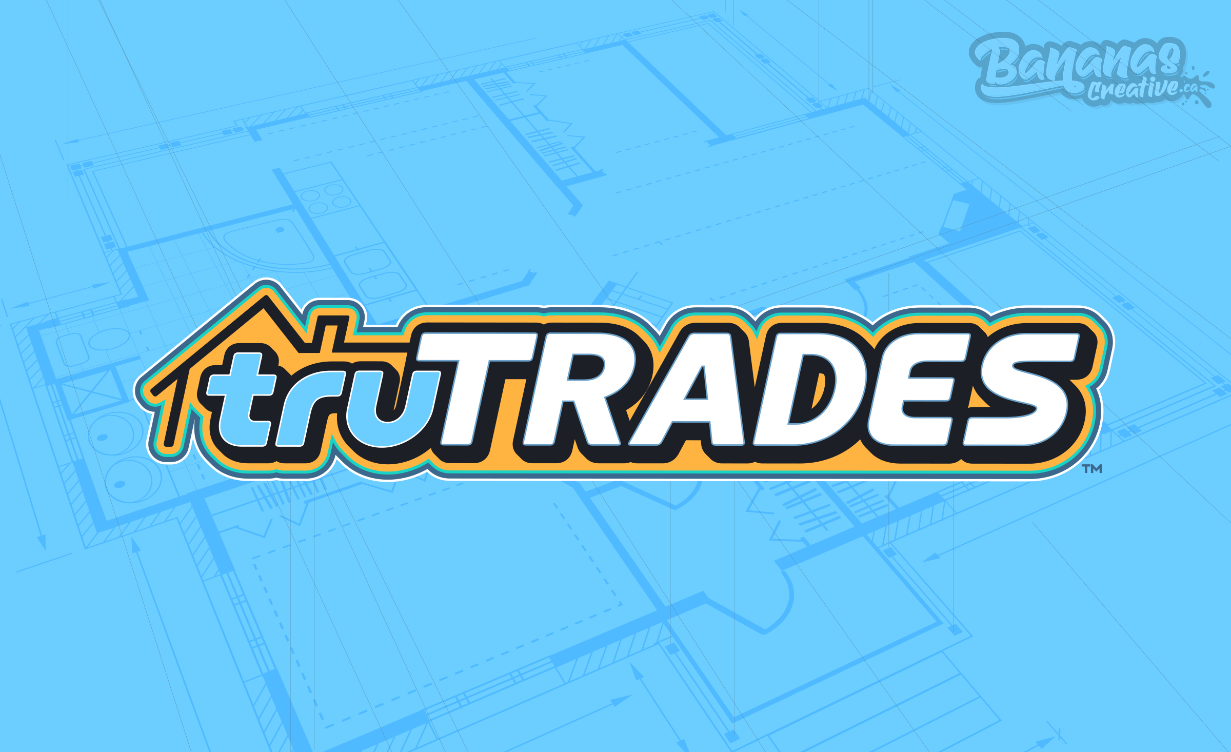
Tru Trades | Branding and Marketing for a Contracting Company in Calgary
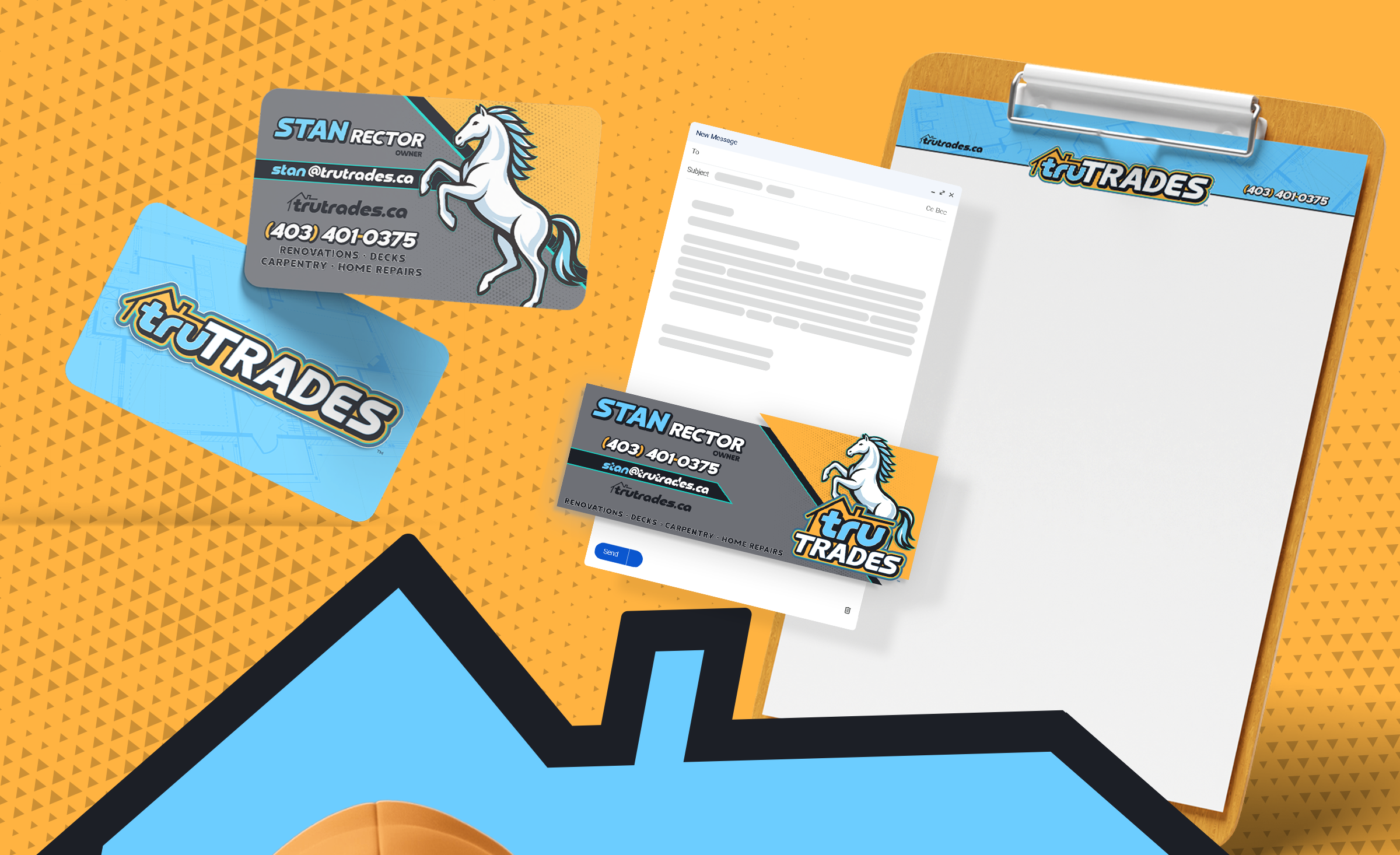
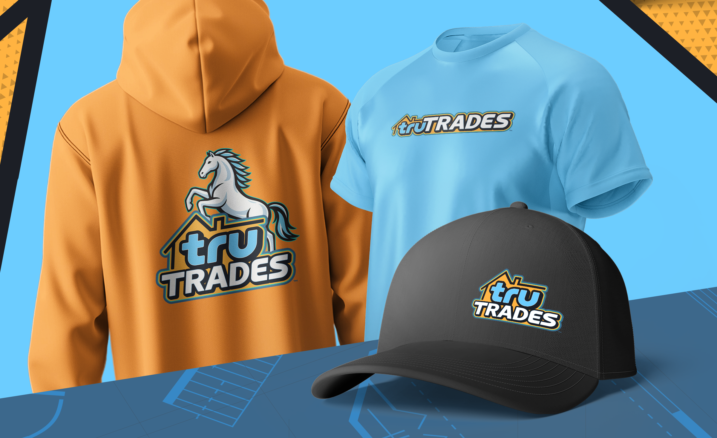
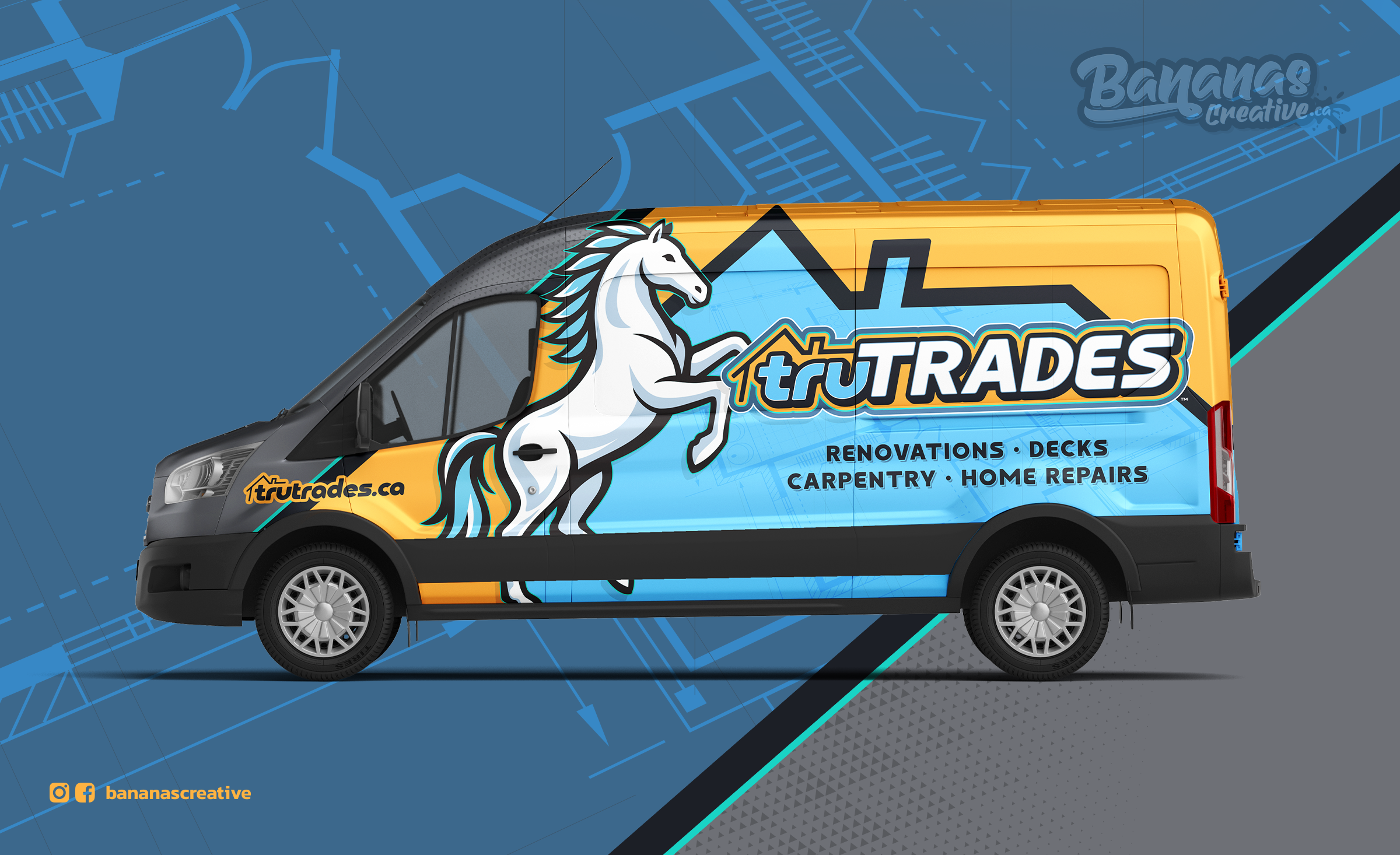
Tru Trades, a Calgary-based contracting company, was developed as a bold and dependable brand designed to stand out in the renovation industry. At the heart of the identity is a powerful stallion symbol, representing the precision, strength, and grace the company brings to every project. The visual identity combines a dynamic palette of blue tones with vibrant orange and teal accents. The blues convey professionalism, energy, and freshness, while the orange and teal introduce contrast, vibrancy, and a modern edge within the industry. A defining feature of the brand is its stallion mascot, inspired by e-sports design aesthetics to reinforce the company’s expertise, confidence, and forward-thinking approach. The final result is a strong and memorable brand that communicates reliability, capability, and trust. The identity was seamlessly extended across vehicle wraps, business cards, uniforms, and marketing materials, creating a cohesive and impactful presence across every customer touchpoint.