


.jpg)


Floorescent | Branding and Marketing for a Flooring Company in Edmonton, AB.
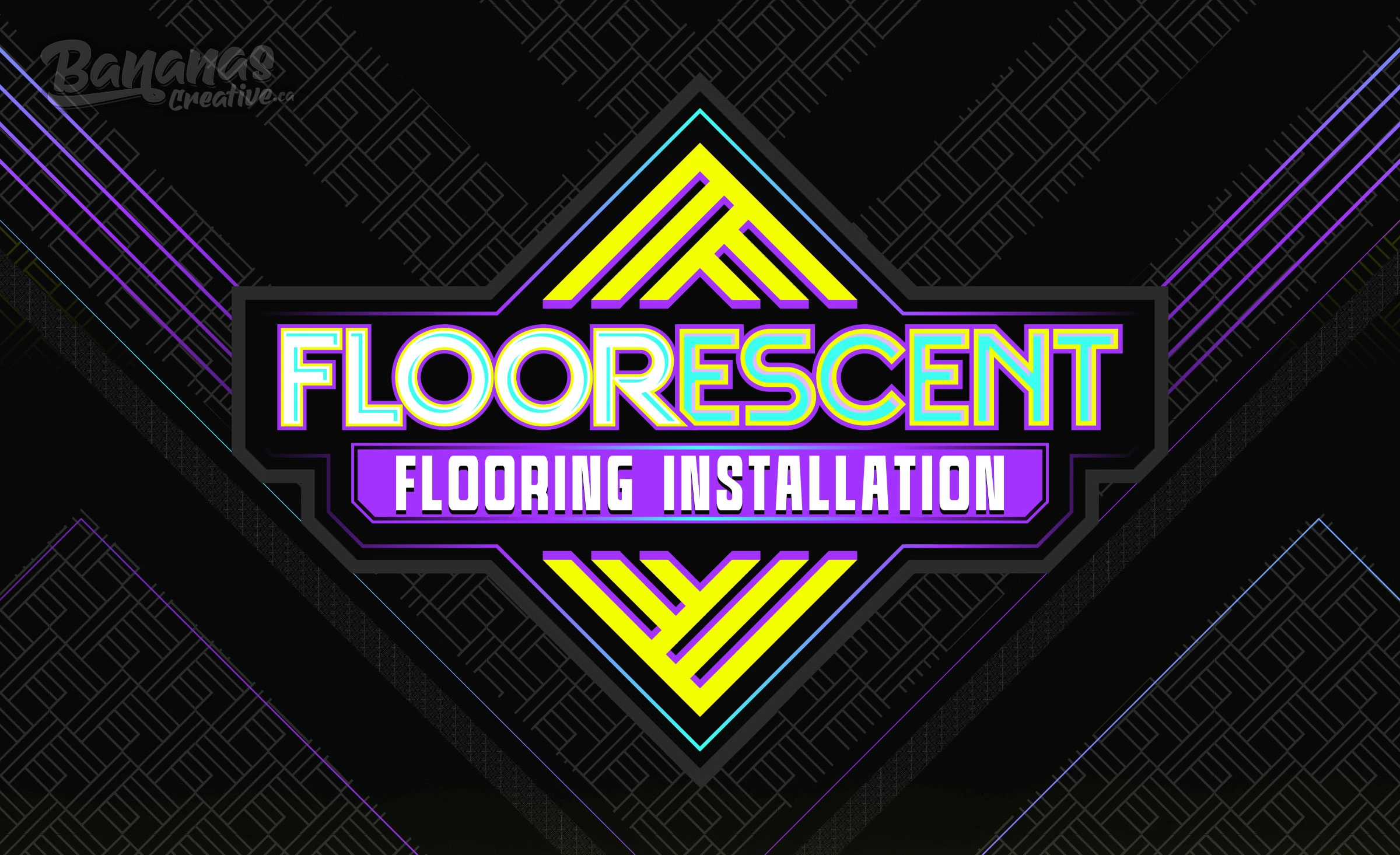
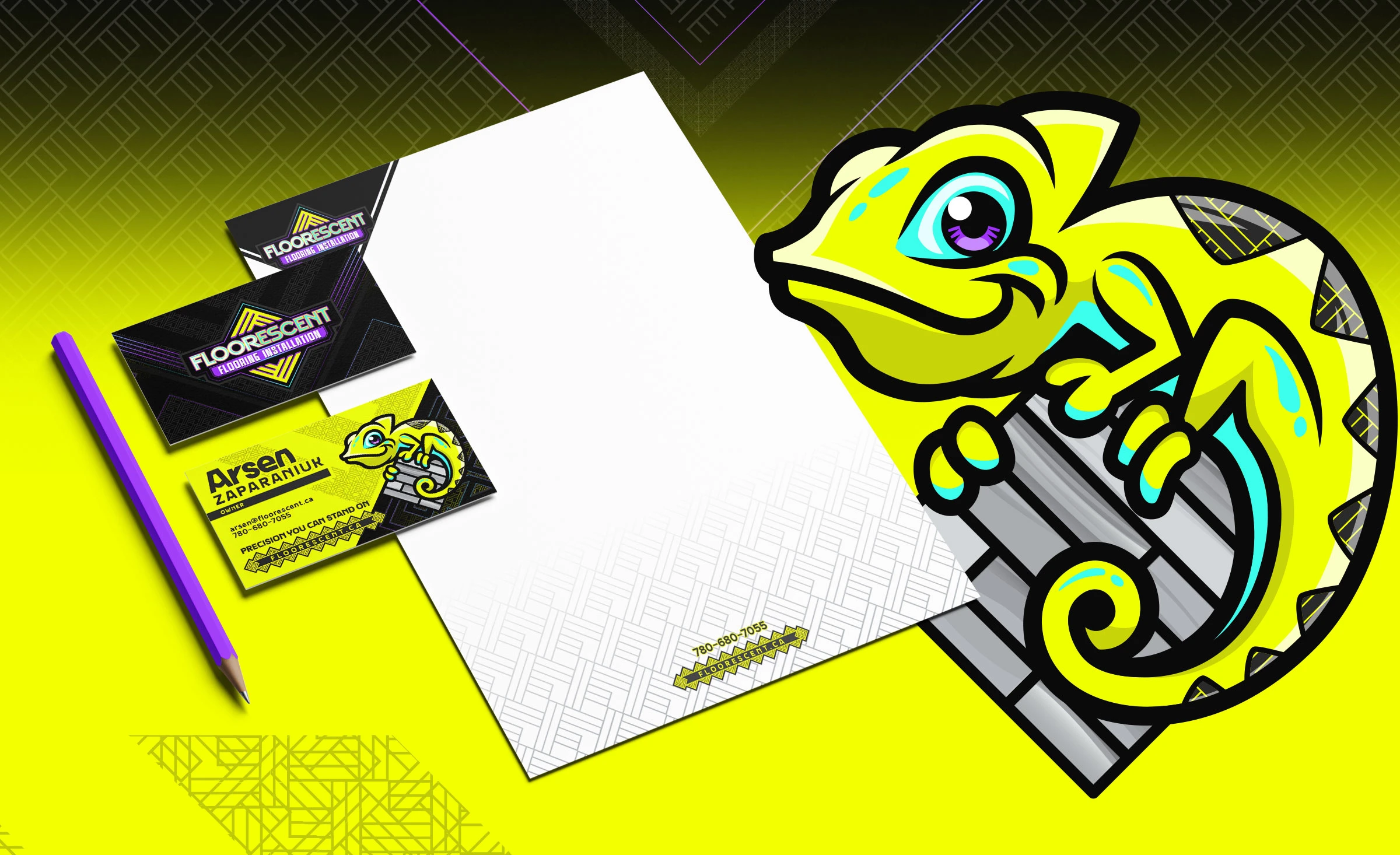
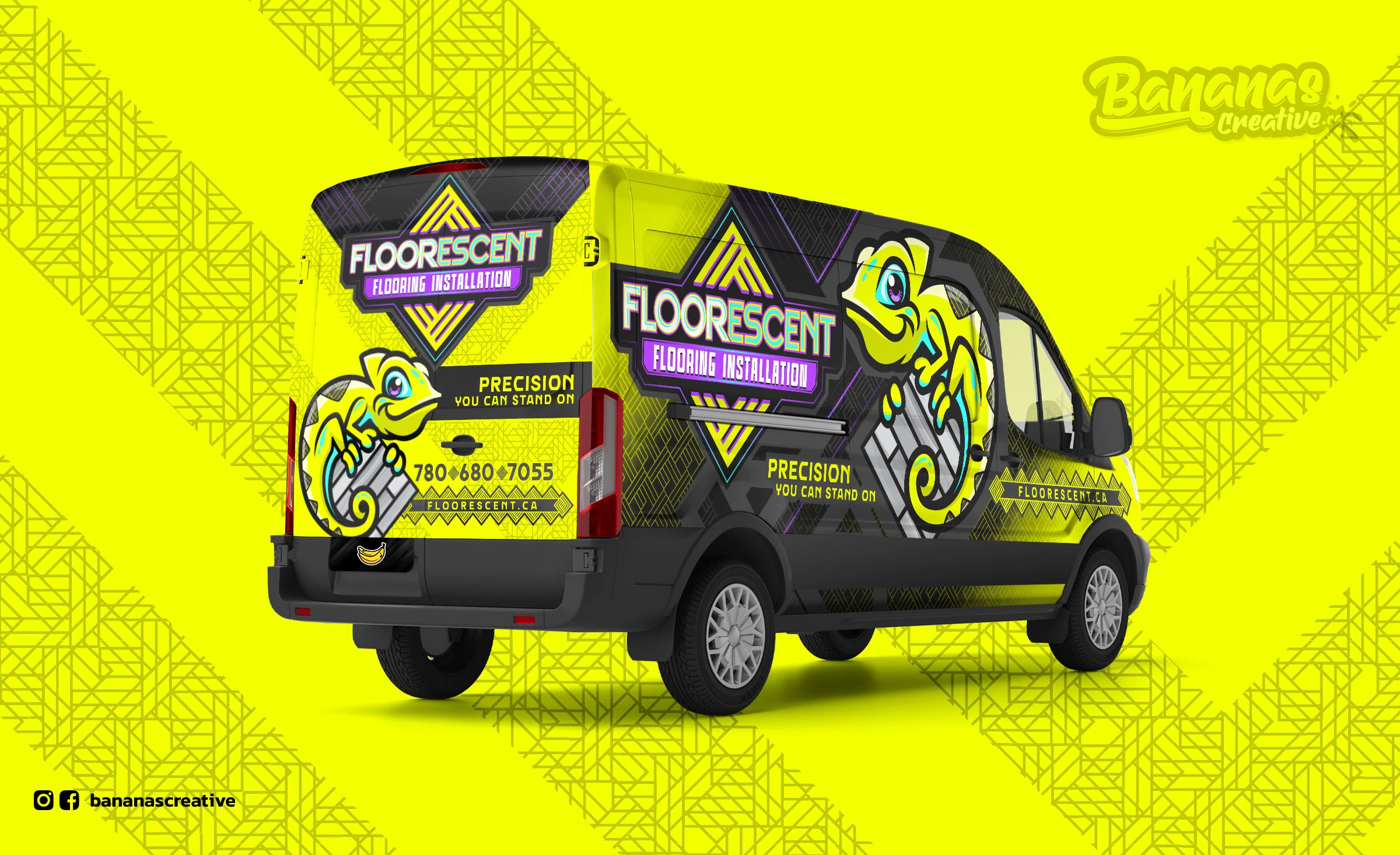
Floorescent, an Edmonton-based flooring company, was developed as a bold and memorable brand designed to stand out in the home services industry. The name Floorescent is a fusion of the words floor and fluorescent, creating a unique identity that speaks directly to the industry while reflecting the brand’s vibrant and modern approach. The visual identity combines electric teal, vibrant purple, and neon lime with graphite and black for contrast, creating a striking and recognizable presence. At the heart of the brand is Flo, a chameleon mascot that symbolizes adaptability, precision, and the company’s commitment to customer satisfaction. Just as a chameleon adapts to its environment, Floorescent adapts to each project, delivering flooring solutions tailored to every home and client. The result is a premium brand that feels clever, approachable, and confident. It represents a company homeowners can trust to deliver exceptional craftsmanship, clear communication, and a seamless experience from start to finish. The visual identity was thoughtfully applied across every brand touchpoint, including vehicle wraps, uniforms, business cards, printed materials, and digital platforms, creating a cohesive and professional experience that reinforces the Floorescent brand wherever it appears.